Typography is an essential element of visual communication, influencing how we perceive and interact with written content. Among the diverse types of fonts available, freaky fonts stand out as a unique and dynamic category. They defy conventional rules, breaking boundaries with their quirky, bold, and sometimes chaotic designs. This article delves deep into the world of freaky fonts, exploring their history, applications, design principles, and impact on modern visual culture.
What Are Freaky Fonts?
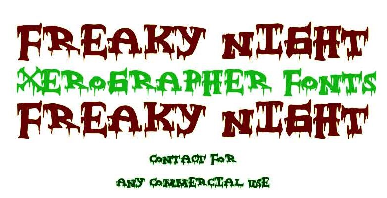
Freaky fonts are typefaces that challenge traditional typography norms. They often feature unconventional shapes, irregular alignments, exaggerated strokes, and experimental aesthetics. Unlike standard serif or sans-serif fonts, freaky fonts are designed to evoke emotion, grab attention, and convey a sense of individuality or rebellion.
Characteristics of Freaky Fonts:
- Irregular Design: Freaky fonts often break the symmetry and uniformity found in traditional typefaces. Letters may have uneven sizes or unexpected shapes.
- Bold and Expressive: These fonts are unapologetically bold, often featuring exaggerated curves, jagged edges, or distorted forms.
- Playful and Creative: Freaky fonts embrace creativity, often incorporating elements like doodles, grunge textures, or abstract art.
- Attention-Grabbing: Their unconventional nature makes them ideal for capturing attention in designs meant to stand out.
The History of Freaky Fonts
Typography has evolved significantly over centuries, from the earliest handwritten scripts to digital fonts. Freaky fonts emerged as a reaction to the rigid rules of traditional typography, gaining popularity in the 20th century during artistic movements like Dadaism, Surrealism, and Punk.
- Dadaism (1910s-1920s): The Dada movement rejected conventional art and embraced absurdity and chaos. Typography during this era featured cut-out letters, mismatched fonts, and playful arrangements.
- Psychedelic Era (1960s-1970s): The counterculture movement popularized colorful, warped, and hand-drawn fonts, often seen on concert posters and album covers.
- Punk Aesthetic (1970s-1980s): Punk rock brought raw, DIY-inspired fonts to the forefront, characterized by jagged edges, uneven spacing, and rebellious energy.
- Digital Age (1990s-Present): The rise of digital tools expanded the possibilities for creating freaky fonts. Designers could experiment with distortion, layering, and 3D effects to push the boundaries of typography further.
Applications of Freaky Fonts
Freaky fonts have a wide range of applications, particularly in projects that demand creativity and boldness. Here are some common uses:
1. Branding and Logo Design
Brands that want to convey a sense of uniqueness and individuality often use freaky fonts in their logos. These fonts help establish a memorable identity and set the brand apart from competitors.
2. Advertising and Marketing
In the crowded world of advertising, grabbing attention is crucial. Freaky fonts are effective in creating eye-catching headlines and visuals that leave a lasting impression.
3. Album Covers and Music Posters
Music genres like punk, rock, and electronic often use freaky fonts to reflect their edgy and experimental spirit. Iconic album covers featuring these fonts have become cultural symbols.
4. Video Games and Movie Titles
The entertainment industry frequently uses freaky fonts for video game titles, movie posters, and promotional materials. These fonts help set the tone and mood of the content.
5. Social Media Graphics
On platforms like Instagram and TikTok, where visuals play a crucial role, freaky fonts are popular for creating bold, trendy, and shareable content.
Designing with Freaky Fonts
Using freaky fonts effectively requires a balance between creativity and readability. Here are some tips for designing with these fonts:
1. Understand the Context
Before choosing a freaky font, consider the purpose and audience of your design. While these fonts are great for creative projects, they may not be suitable for formal or professional contexts.
2. Pair with Simpler Fonts
To maintain readability, pair freaky fonts with simpler, more traditional typefaces. Use the freaky font for headlines or accents and the simpler font for body text.
3. Experiment with Colors
Freaky fonts often look best when paired with vibrant, contrasting colors. Experiment with color palettes to enhance the visual impact of your design.
4. Use Sparingly
While freaky fonts are attention-grabbing, overusing them can overwhelm the viewer. Use them strategically to highlight key elements of your design.
5. Test Readability
Always test your design to ensure that the text is legible. Freaky fonts can sometimes compromise readability, especially in smaller sizes.
The Impact of Freaky Fonts on Visual Culture
Freaky fonts have influenced modern visual culture in profound ways. They challenge traditional notions of typography, encouraging designers to think outside the box and embrace experimentation. These fonts have also become a symbol of creativity, individuality, and self-expression.
- Inspiring Creativity: Freaky fonts push the boundaries of what typography can be, inspiring designers to explore new ideas and techniques.
- Cultural Significance: From punk rock posters to modern social media campaigns, freaky fonts reflect the values and aesthetics of their time.
- Expanding Accessibility: Digital tools and online font libraries have made it easier than ever to access and use freaky fonts, democratizing their use across industries.
Popular Freaky Fonts and Designers
Several typefaces and designers have become synonymous with the freaky font aesthetic. Here are a few noteworthy examples:
Famous Freaky Fonts:
- Bleeding Cowboys: A grungy, distressed font often used in rock and metal designs.
- Comic Sans: While polarizing, its unconventional design aligns with the playful nature of freaky fonts.
- Lobster: A retro script font with a quirky charm.
Influential Designers:
- David Carson: Known for his experimental approach to typography, Carson’s work in magazines like Ray Gun embodies the essence of freaky fonts.
- Paula Scher: A graphic designer who often incorporates bold and unconventional typography into her projects.
- Neville Brody: Renowned for his innovative use of type in design, particularly in the music industry.
The Future of Freaky Fonts
As technology continues to evolve, the possibilities for creating and using freaky fonts are limitless. Augmented reality (AR) and virtual reality (VR) are opening new avenues for interactive and immersive typography. AI-driven design tools are also enabling designers to experiment with type in unprecedented ways.
Moreover, the growing emphasis on individuality and self-expression in design ensures that freaky fonts will remain relevant and celebrated. They are not just a trend but a testament to the enduring power of creativity in visual communication.
Conclusion
Freaky fonts are more than just unconventional typefaces; they are a celebration of creativity, rebellion, and individuality. From their historical roots in artistic movements to their modern applications in branding, advertising, and digital media, these fonts continue to shape the way we experience typography.
Whether you’re a designer looking to make a bold statement or a brand aiming to stand out, freaky fonts offer endless possibilities for experimentation and innovation. Embrace the freaky, and let your creativity run wild!